ephemera
design history
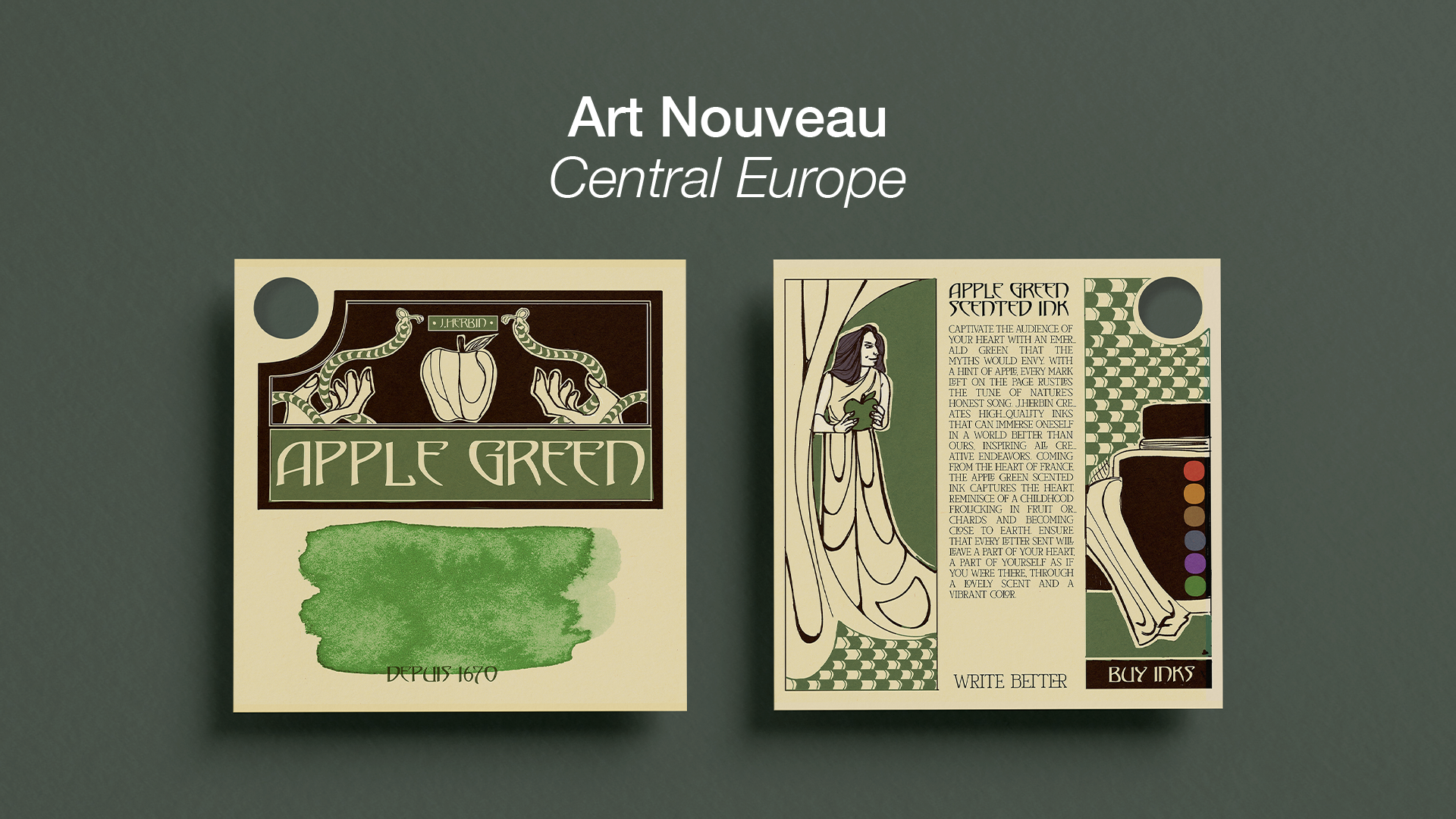
J. Herbin is a premiere brand selling ink for artists and fountain pen enthusiasts. With a strong history of travel, the French brand speaks to that history with every quality color of ink they produce.
For every design movement from the late 18th century to the present day, I designed an ink swatch card to interpret that style, and show the brand’s presence across the decades.
Program: Adobe Photoshop, Adobe InDesign, Adobe Illustrator
Not affiliated with J.Herbin; created as a student project


process
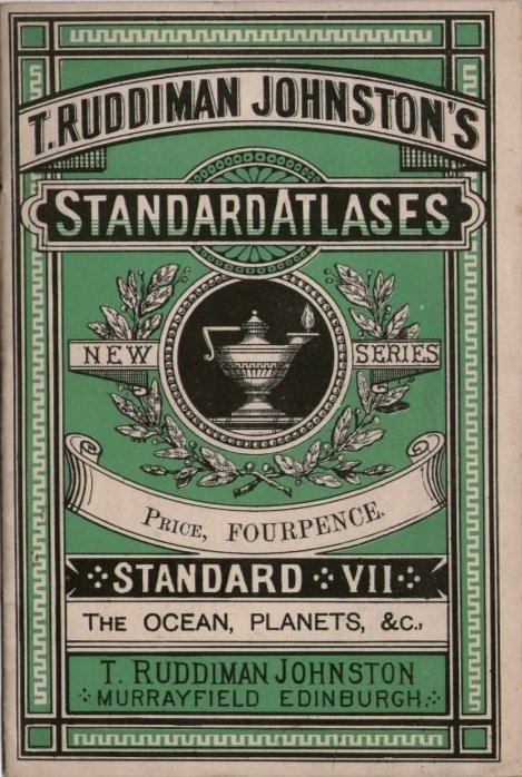
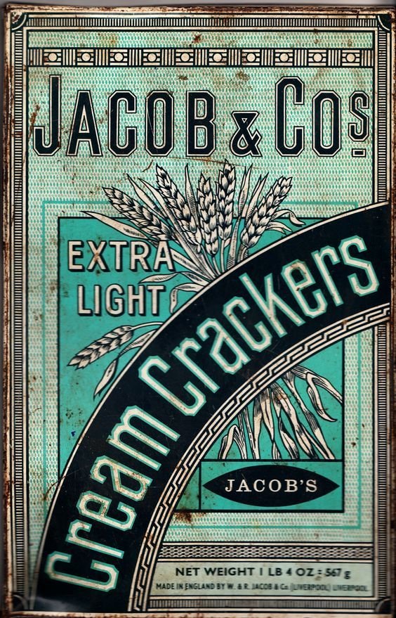
Research
Because we are representing a specific movement in design history, I would research the time period, notable artists + work of the time, and printing technology, to collect as much information as required to best replicate the style. Seen here are examples of typography used in the Victorian era for the corresponding swatch.
sketching
Prior to starting this series, I developed a template, so I could focus my sketching on different compositions and ideas to best convey the design style being replicated. Once I like a specific composition, I would clean up that sketch. I like to clarify my sketches because the working size of this design is rather small and has to be tight for legibility.
final draft
After finalizing the sketch that I feel confident will translate the style best, I begin to build out the design in Photoshop. Each swatch card had a quick turnaround, so it was about developing a design and interpreting the style fast without sacrificing quality.